flex-direction:column;&flex-wrap:wrap;组合使用宽度计算错误
如题,当某个项目的布局是两行自适应的横向排列的时候,偶然发现flex-direction:column;与flex-wrap:wrap的组合很适合做这种事情:
<div class="main">
  <div class="box1">
    <div class="p1"></div>
    <div class="p1"></div>
    <div class="p1"></div>
    <div class="p1"></div>
    <div class="p1"></div>
    <div class="p1"></div>
  </div>
</div>
.main {
  width: 300px;
  display: flex;
  overflow: scroll;
}
.box1 {
  height: 100px;
  display: flex;
  flex-direction: row;
  writing-mode: vertical-lr;
  justify-content: space-between;
  flex-wrap: wrap;
  align-content: flex-start;
  flex-shrink: 0;
  width: auto;
}
.p1 {
  width: 40px;
  height: 40px;
  background: #333;
  border: 1px solid white;
}
效果如下:

从这里看上去一切正常,但是如果给.box1加上一个背景,问题就出来了
.box1 {
  background: gray;
}
效果2:
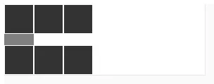
可以看到.box1的宽度只有一个子元素的宽度。这是一个浏览器的bug,当使用flex-direction:column;时,父元素只会获得一个子元素的高度,即使使用了flex-warp:warp进行换行也是这样。
解决方法
既然flex-direction:column不能使用,那我们不妨换个思路,使用flex-direction:row也是可以实现竖排换行的效果的。我们只需要把浏览器书写顺序倒一下。
.box1 {
  flex-direction: row;
  writing-mode: vertical-lr;
}
用上上面这段代码,就能无痛解决这个宽度问题了。
网上还有另一个解决思路是使用visibility:collapse;,代码如下:
这里假设p1width等于一个.p1的宽度
.box1 > div.last {
  content: ' ';
  display: block;
  visibility: collapse;
  width: p1width;
}

.box1 > div.last:nth-child(3),
.box1 > div.last:nth-child(4),
{
  width: p1width * 2;
}

.box1 > div.last:nth-child(5),
.box1 > div.last:nth-child(6),
{
  width: p1width * 3;
}
/* ...more... */
实际上,这跟直接定义.box1的宽度差别也不大,且visibility:collapse的作用也没有writing-mode明确,很容易让人晕头转向
参考资料:
http://codingdict.com/questions/16501
https://stackoverflow.com/questions/39095473/flexbox-wrong-width-calculation-when-flex-direction-column-flex-wrap-wrap
https://www.coder.work/article/1120651